Please note that there is a file on Canvas called Getting started with R which may be of some use. This provides details of setting up R and Rstudio on your own computer as well as providing an overview of inputting and importing various data files into R. This should mainly serve as a reminder.
Recall that we can clear the environment using rm(list=ls()) It is advisable to do this before attempting new questions if confusion may arise with variable names etc.
Example 1
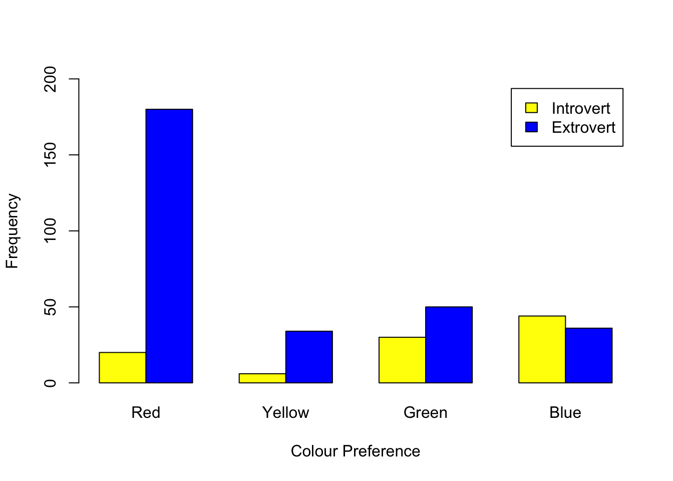
In this example, we will investigate whether there is an association between personality and colour preference. This is an elaboration on Example 3.5 in the lecture notes using R. Here is the data:
On the face of it, it looks like a higher proportion of Extroverts prefer the colour red, but we will have to now proceed with a statistical approach, i.e. a chi-square test of association using the following code:
In terms of the assumptions, we can check independence by inspection and we check the expected frequencies using the following code:
result$expected
          Red Yellow Green Blue
Introvert  50     10    20   20
Extrovert 150     30    60   60
The output shows no expected frequency is less than 5, satisfying the assumption.
Returning to the chi-square test output, we see that we have a significant result, i.e. we reject the null hypothesis that there is no association and conclude that there appears to be an association between personality and colour preference. Next we calculate the effect size. For this we need the “vcd” package in R, see below:
install.packages("vcd")
library(vcd)assocstats(PersonalityMatrix)
                    X^2 df   P(> X^2)
Likelihood Ratio 70.066  3 4.1078e-15
Pearson          71.200  3 2.3315e-15

Phi-Coefficient   : NA
Contingency Coeff.: 0.389
Cramer's V        : 0.422
Cramer’s V of 0.422 indicates a medium to strong effect. Finally, we perform post hoc testing using the standardized residuals approach.
            Red Yellow Green  Blue
Introvert -4.24  -1.26  2.24  5.37
Extrovert  2.45   0.73 -1.29 -3.10
We can think of the standardized residuals as \(z\)-scores, therefore, we look for \[
|\text{standardized residual}|>1.96
\] to be significant at the 5% level. Therefore, the values -3.1 and 2.45 are significant for Extrovert, which indicates that fewer extroverts prefer blue and more extroverts prefer red. The values 5.37 and -4.24 for Introvert are also significant, indicating that more introverts prefer blue, but fewer introverts prefer red.
Exercise 1
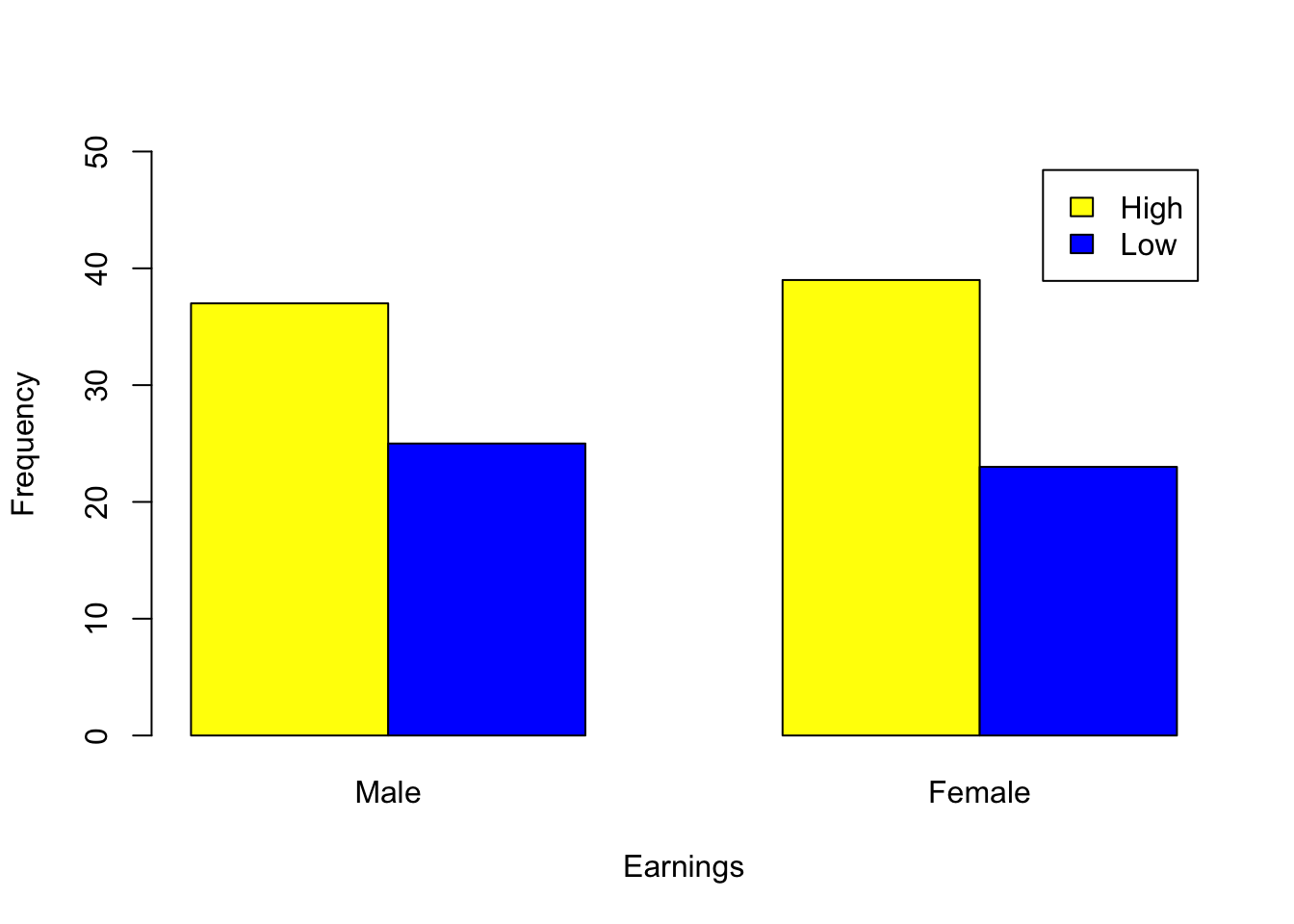
Investigate, checking the relevant assumptions, whether there is any relationship between Male and Female staff and Earnings based on the data provided by a local company below:
Male
Female
High Earnings
37
39
Low Earnings
25
23
If there is an association investigate this.
Hint: Clearly this is a \(2\times2\) contingency table and hence we must use Yates’ continuity correction (checking assumptions). In R, this is performed using the correct=T option of the chi-square test, see below:
    Pearson's Chi-squared test with Yates' continuity correction

data:  EarningsMatrix
X-squared = 0.033991, df = 1, p-value = 0.8537
We should also check the expected frequencies assumption
result2$expected
     Male Female
High   38     38
Low    24     24
Note that no expected frequency is <5. Independence is also satisfied by visualisation.
The p-value is 0.8537>0.05, therefore we conclude that there does not appear to be a relationship between earnings and male/female staff.
Example 2
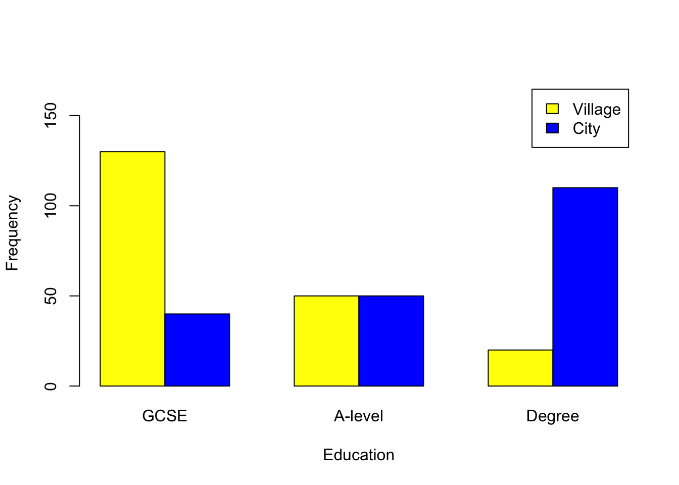
This example will look at using the linear-by-linear option when testing for association between ordinal variables (see Remark 3.3 in the lecture notes). Independence may be assumed, but check the expected frequencies assumption. We will investigate whether there is an association between education levels and where people live using the following fictitious dataset.
        GCSE A-level Degree
Village  130      50     20
City      40      50    110
Follow the steps below in R.
Task: input the variables and create a matrix called EducationMatrix.
Check your matrix agains the output below:
GCSE A-level Degree
Village 130 50 20
City 40 50 110
        GCSE A-level Degree
Village   85      50     65
City      85      50     65
Note that no expected frequency is \(<5\). We now perform the linear-by-linear test (as we have an ordinal variable) using the code below. Note that we first need to covret the data into “table” form.
tab<-as.table(EducationMatrix)tab
        GCSE A-level Degree
Village  130      50     20
City      40      50    110
library(coin)result4<-lbl_test(tab)result4
    Asymptotic Linear-by-Linear Association Test

data:  Var2 (ordered) by Var1 (Village, City)
Z = -10.449, p-value < 2.2e-16
alternative hypothesis: two.sided
This result is significant, hence there appears to be an association between location and educational levels. Next we calculate Cramer’s V:
library(vcd)assocstats(EducationMatrix)
                    X^2 df P(> X^2)
Likelihood Ratio 118.76  2        0
Pearson          109.95  2        0

Phi-Coefficient   : NA
Contingency Coeff.: 0.464
Cramer's V        : 0.524
As we have a significant result, we finally perform a post hoc test.
         GCSE A-level Degree
Village  4.88       0  -5.58
City    -4.88       0   5.58
This, together with the bar charts, indicates that more people in cities have a degree as their highest qualification, while more people in the villages have GCSEs as their highest qualification.